The problem
In Texas, a psychiatric advance directive, or PAD, allows someone to make their preferences for their health known in case of an emergency mental health crisis. The dense legal form is taken directly from Texas statute and is difficult to read. But people living with serious mental illness need a resource to help them navigate their rights under Texas law. The client, an academic specializing in social justice and population health, reached out to Sentier for help creating a how-to guide for the Texas PAD. While this effort was focused specifically for those living with serious mental illness, it applies to all cases of mental illness where an advanced directive would be helpful.
The client wanted to give Texans with mental illness a chance to understand a legal document that could be lifesaving in difficult situations. Sentier, with the ability to leverage researchers to test cutting-edge digital designs with real users, was an ideal partner for the project. The project would focus on producing an accessible how-to guide to better serve the PAD’s target population and empower people with mental illness to advocate for the care they need and deserve.
The Sentier team executed a two-phased approach to the problem: First, designers created and laid out the guide in a user-friendly way based on usability heuristics. Second, researchers interviewed medical and legal professionals, as well as people with lived experience of mental illness, to assess the efficacy of the new document.
Design process
Sentier designers kept the wellbeing of the individuals who need to fill out a Texas PAD top of mind throughout the design process. After orienting to the situation by dissecting document phrasing and understanding communication intent, designers charted the steps for creating the best possible PAD how-to-guide.
- Designers broke up the text of the guide, making it easier for users to read and process vital information.
- They added icons to textual elements like links, definitions, and reminders that commanded attention and improved recall.
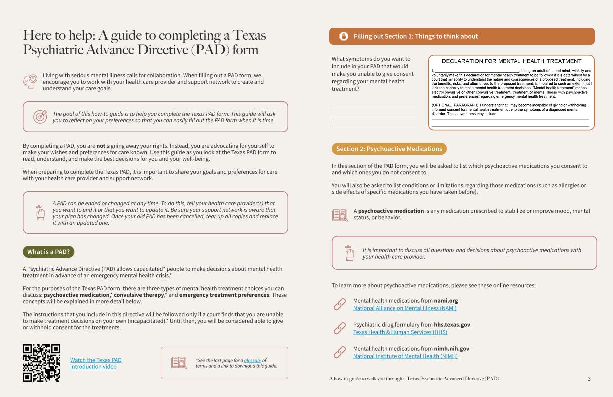
- They also added screenshots of specific sections from the form into the guide itself to help readers understand which part of the guide applied to which page of the form.
- To provide context for medical and legal language, designers included terms in a glossary at the end of the document and defined them on relevant pages.
Color palettes and font selection were meant to add to the ease of filling out this type of document. Designers chose calming colors for the background and even opted for muted accent colors such as burnt orange and navy blue. They paired a large, rounded serif font with an easy-to-read sans serif font to achieve a professional yet approachable atmosphere.
Designers added screenshots of specific sections from the form into the guide itself to help readers understand which part of the guide applied to which page of the form. Medical and legal terms, such as “psychoactive medication,” were defined to guide the reader through filling out the form.
Research process
With a promising product in hand, it was time to see if it measured up to legal standards and resonated with real users. Sentier researchers conducted 10 in-depth interviews with participants across three groups: legal professionals, medical professionals, and individuals with a history of mental illness.
During each session, participants reviewed the how-to guide and discussed potential improvements to it. Participants were also asked to provide feedback on the introductory PAD video, which was referenced in the how-to-guide but separate from the current project’s scope.
Interview data indicated that:
- Visual elements were well received; font, white space, muted colors, and iconography contributed to “soothing” and “inviting” experiences.
- The language could benefit from minor adjustments that would support wider accessibility to users of varying reading levels. Glossary terms were revised to ensure legal and medical definitions were accurate and easy to understand.
- QR codes would improve the guide’s usability when links could not be interacted with, most notably when the document was printed and available in medical offices.
Impact
These data-driven recommendations were implemented, and the client received a new and improved guide that would be a valuable resource to Texans living with mental illness and their loved ones. The client invited stakeholders and study participants to a product unveiling, and guests were excited to see their feedback in action.
The PAD guide was published in January 2024 and has been in use for 1 year. It exists online as a resource for people living with mental illness as well as medical providers. Grounded in user-centric design and validated by ethical and thoughtful research with real users, the PAD how-to-guide is a testament to the meaningful work happening in healthcare and the value of marrying UX research and design.
Are you navigating similar complexities? Gain the clarity you need to make confident decisions that drive real impact. Whether you’re working with sensitive or protected information in the healthcare space or aiming to design experiences that serve the needs of your audience, Sentier is here to help.
Ways to connect:
Dr. Virginia Brown, PHD, MA at The Hastings Center
Linkedin
We want to hear from you! Please visit the Public Common License for further information regarding the PAD How-To Guide and be sure to keep us posted on your thoughts and usage of this document. We are always looking for opportunities to take this guide to the next level to continue helping those living with mental illness.
